

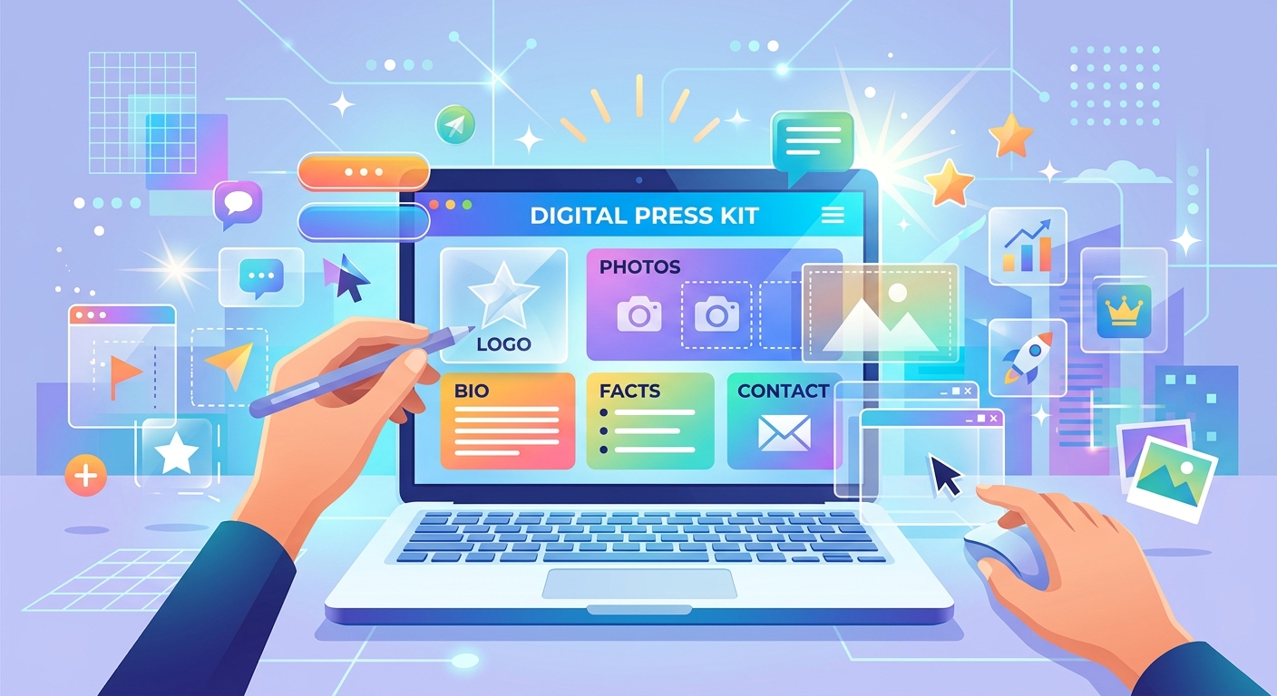
Journalists receive dozens of pitch emails every week. The ones that actually get opened are the ones that arrive with clean, ready-to-use visuals already attached. A well-prepared press kit signals that you take your brand seriously and that working with you will be frictionless. The best part is that you do not need a full design team or an expensive software subscription to build one. Free transparent PNG graphics give you the raw material to put together something genuinely polished, even on the tightest budget.
Press Kit at a Glance
A digital press kit is your brand's visual handshake with media and partners. By sourcing free transparent PNGs across categories like logos, icon sets, social banners, and product imagery, you can assemble a credible, layered kit without expensive design software. This guide covers selecting assets by purpose, combining them cleanly for web, print, and social contexts, organizing files for a clean handoff, and packaging everything into one shareable document ready to send.
What a Press Kit Actually Needs to Accomplish
A press kit is not a portfolio. It is not a brochure. Its job is to hand a reporter, podcast host, or newsletter editor everything they need to feature your brand without sending a single follow-up email. That means logos in multiple formats, graphics sized for different contexts, and files that open without problems on any machine or operating system.
Transparent PNGs are what make this genuinely achievable. Because the background is empty, a journalist can drop your logo or icon directly into their article layout, newsletter header, or social graphic without cutting around a white box or requesting a different file format. The asset simply works wherever it lands. That usability has real value for people working under deadline.
Choosing the Right Assets From a Free PNG Library
Not every press kit needs the same mix of files. Start by thinking in categories. Each type of graphic serves a distinct purpose, and having solid options in each one gives the person receiving your kit genuine flexibility.
Logos and Brand Marks
Your logo is the foundation of the whole kit. Aim for at least three versions: full color on a transparent background, a white variant for dark layout contexts, and a simplified icon or mark for tight spaces where the full horizontal logo is too wide. Free PNG libraries carry a wide range of logo-style graphics that can serve as structural references while you assemble your own files. If your actual logo is already saved as a transparent PNG, it is ready to go directly into the kit.
Icon Sets and Category Graphics
Icon sets are among the most useful assets you can include. They give journalists and editors a way to illustrate content fast. A software brand might include device and interface icons. A wellness brand might include plant, movement, or lifestyle graphics. Because these assets are transparent PNGs, editors can place them directly onto any background color without extra steps. That ease of use is a genuine advantage for anyone producing content on a tight schedule.
Social Banners and Cover Images
Platform cover images often work as base layers in press kit compositions. A banner-sized PNG with an abstract shape or brand-relevant visual sits at the bottom of a layered layout. Your logo and supporting icons stack cleanly on top. Free PNG libraries with broad category coverage make it possible to find background-style graphics that match the aesthetic of almost any brand type, giving you a starting point even before your own custom photography is ready.
Product and Lifestyle Imagery
Cutout-style product PNGs with transparent backgrounds are a staple for any kit tied to a physical or digital product. They give editors an image that fits neatly into any layout without clashing with surrounding design elements. Free libraries carry a strong range of product-adjacent imagery that can fill visual gaps while you build out dedicated photo assets of your own.
Layering PNG Assets Cleanly Across Different Contexts
The same asset does not behave identically in every context. A PNG that looks sharp in a web layout can go soft in print. One that reads clearly on a white background can disappear against a dark theme. Understanding how PNG graphics perform across different output types keeps your press kit looking consistent wherever it ends up being used.
The PNG format was built for lossless compression and full alpha channel transparency, properties documented in the PNG standard published by the W3C. That precise transparency behavior is exactly why PNG remains the default choice for any graphic that needs a clean, editable edge rather than a compressed, lossy one.
For Web Contexts: Keep Resolution Sensible
Web-destined PNGs should be crisp without being oversized. Seventy-two to ninety-six PPI is typical for screen use. Always check how your layered composition reads on both light and dark backgrounds. An icon drawn with a light gray outline can vanish completely against a dark mode layout if you only previewed it against white.
For Print Contexts: Resolution Is Not Negotiable
Print requires higher resolution than most people expect. Any PNG going into a printed press folder or physical media kit needs to be at least 300 PPI. Most free PNG libraries offer high-resolution downloads. Check pixel dimensions before committing to a file. A 500 by 500 pixel icon looks fine as a small thumbnail but goes noticeably soft when printed at any larger size.
For Social Media: Match Platform Dimensions Exactly
Each social platform has its own image dimensions, and those specs shift over time. Build your social press kit graphics to the largest current recommended size, then scale down as needed. Layering transparent PNGs at full social dimensions means you can adapt compositions across multiple platforms by adjusting the canvas rather than rebuilding each layout from scratch.
How PNG Asset Types Perform Across Different Press Kit Outputs
Asset Format Performance by Delivery Context
| Asset Type | Web Ready | Print Ready | Social Ready |
|---|---|---|---|
| Logo PNG (full color, transparent background) | Yes | At 300 PPI or higher | Yes |
| White logo variant | Dark backgrounds only | Dark backgrounds only | Dark-themed banners |
| Icon set PNGs | Yes | Verify pixel dimensions first | Yes, particularly at small sizes |
| Product cutout PNG | Yes | Check resolution before committing | Yes |
| Social banner PNG | Header and cover images | Not recommended | Yes, native platform use |
Organizing Files So Journalists Can Find What They Need Fast
A press kit buried in a chaotic folder is a press kit that does not get used. File organization is part of the product you are delivering. A reporter who clicks your download link should be able to locate the right file within thirty seconds, without opening every subfolder or reading a lengthy instruction document.
A clean folder structure that works for almost any press kit looks like this:
- Logos/ holding full-color, white, and dark variants at both standard and high-resolution sizes
- Icons/ sorted by theme or category with self-explanatory filenames
- Banners/ containing platform-specific social graphics labeled clearly by dimension
- Products/ for cutout-style product imagery with transparent backgrounds
- Brand_Guide.pdf listing your hex color codes, font names, and brief usage guidance
- README.txt with one short paragraph describing each folder and any usage conditions
File naming matters just as much as folder structure. A file called "logo_fullcolor_transparent_2000px.png" tells someone everything before they open it. A file called "final_logo_USE_THIS_v3.png" tells them nothing useful at all. Descriptive names save everyone time, including you when you return to update the kit six months later.
Converting Your Finished Layouts Into One Portable Document
Organized folders and zipped files work well for designers who plan to edit assets further. For journalists, bloggers, and PR contacts, a single document is far easier to reference, forward, and file. A reporter who receives a well-structured PDF can scroll through it on any device, share it with a colleague, and return to it weeks later without needing to unzip anything or hunt through nested folders.
You do not need design software to create that final document. A PNG to PDF converter lets you stack your finalized PNG layouts into one clean file that preserves your visual choices exactly as you built them. No color shifts, no transparency issues, no layout drift. What you assembled is what the recipient sees when they open it.
Structure the PDF with purpose. Lead with your full-color logo on a clean white page. Follow with an icon overview, your banner previews, and your product imagery. Close with a contact page that includes your name, email address, and website URL. That sequence tells your visual story in under a minute and hands the recipient everything they need without a single follow-up question.
Making Your Press Kit Work Long After You Send It
Assets sourced, folders clean, document ready. That is where most guides stop. But a press kit only earns its effort if it stays accessible and current after it leaves your hands.
Host the PDF on a dedicated press page of your website, linked from your navigation or footer. Include that direct link in pitch emails rather than attaching the file, which keeps your message lightweight and makes it easier for recipients to share the link. Keep a note of when you last updated the kit and schedule a review at least once a year to refresh any assets that have changed.
The combination of well-chosen transparent PNGs, clean file organization, and a portable export that anyone can open creates a press kit that genuinely does its job. It saves time for the person receiving it. It puts your brand forward in a consistent, usable format without asking anyone to do extra work on the other end. That respect for the recipient's time is what separates a press kit that gets used from one that gets ignored.