

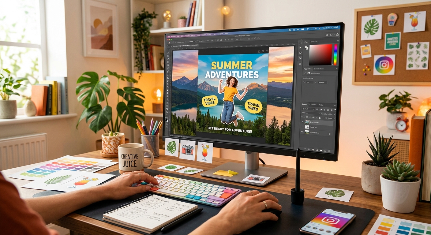
Your graphic is only as good as its layers. That's the truth every designer figures out fast. PNG cutouts give you a floating subject, perfectly trimmed, ready to drop anywhere. Stock photo backgrounds give you a world to place it in. Combine the two, and you can produce social media visuals that look like a full studio shoot, built entirely at your desk.
What This Workflow Gives You
- A method for matching PNG cutouts to stock photo backgrounds that feel intentional
- Layering techniques that make composites read as one cohesive image
- Scale, positioning, and shadow guidance that grounds floating subjects
- Correct export dimensions for the platforms that matter most
- Format decisions that protect quality without inflating file size
Why PNG Cutouts Are the Right Starting Point
A PNG cutout is a graphic file with a transparent background. There is no colored rectangle, no white fill, no bounding box. Only the subject's pixels remain, surrounded by empty, invisible space.
That transparency lives in the file's alpha channel, a dedicated layer of data that stores opacity information for every single pixel in the image. According to the PNG format specification maintained by the W3C, this alpha channel is what separates PNG from older formats that lack true per-pixel transparency. It is the reason a well-prepared PNG cutout drops onto any background without requiring masking, cropping, or manual background removal.
For social media design, this matters a lot. You are not building one image. You are building a repeatable system, swapping backgrounds, adjusting layouts, adapting the same subject to different platforms. A transparent PNG makes that process modular. The subject becomes a building block rather than a fixed asset.
Start with a high-quality cutout. Clean edges are non-negotiable. A subject with precise trimming blends into a background naturally. Jagged pixels or a ghostly white fringe left over from a sloppy background removal will immediately signal "composite" to anyone who looks, no matter how beautiful the background is.
Sourcing Background Images That Actually Work
The background is not decoration. It is context. A thoughtfully chosen background tells the viewer where the subject lives, what mood the brand carries, and whether the overall image feels credible or cobbled together.
Start with tonal matching. If your PNG cutout has warm amber tones, look for backgrounds shot in warm, golden light. Think sun-drenched interiors, warm wood surfaces, and late-afternoon outdoor scenes. If your subject is cool-toned, aim for backgrounds with overcast skies, cool concrete, or water-adjacent settings. Tonal harmony between layers is the single biggest factor in making a composite feel real rather than assembled.
Depth of field works in your favor. Backgrounds with a softly blurred foreground or background layer, those naturally shallow-focus photographs you see in lifestyle and product imagery, tend to receive cutout subjects beautifully. A busy, razor-sharp background competes for the viewer's eye. You want the scene to recede and let the subject come forward.
Texture adds credibility. Marble, linen, rough stone, worn wood planks. These surfaces have imperfection built in, and that imperfection makes the composite feel grounded. A perfectly clean digital gradient rarely sells the illusion as well as a real photographed surface does.
For building out a working image library, you can explore stock photos organized by subject, color, and orientation. Having a shortlist of backgrounds in the right aspect ratio before you sit down to design saves considerable time mid-project.
Layering Your PNG Cutout Over a Background
The compositing process follows the same logic in almost every design tool, whether you use a desktop application, a browser-based editor, or a mobile app. The layer order is what matters, not the specific software.
Place the background image first, as the base layer. Set your canvas to the target social media dimensions before adding any other elements. Building in the correct size from the start gives you an accurate view of how the composition reads at the intended output resolution. Scaling up a design after the fact introduces quality loss and often breaks carefully placed text.
Import the PNG cutout and place it above the background layer. Because the cutout's background is transparent, the stock photo shows through wherever the PNG has no pixels. The two images immediately begin to occupy the same visual space without any clipping or masking step required on your part. The transparency was baked in at the file level.
At this stage, the cutout will likely be centered at its default import size. That's a starting position, not a final one. The real design work comes next.
Scaling and Positioning for a Strong Composition
Scale is the decision that carries the most visual weight. A subject placed too small disappears into the background and reads as a supporting element rather than the focal point. A subject placed too large overwhelms the frame, loses the sense of environment the background was meant to provide, and leaves no room for text.
A practical starting point: let the subject occupy roughly 50 to 70 percent of the frame's height. This gives the image a clear focal point while still showing enough background to tell a visual story. Product images often look better on the smaller end of that range because it preserves breathing room for price points, headlines, or calls to action. Character illustrations and bold graphic elements usually need to lean larger to read clearly at small feed sizes.
Positioning follows standard composition principles. A centered subject works for symmetrical, balanced designs and direct product presentations. Placing the subject off-center, shifted toward one edge of the frame, creates a more dynamic feel and leaves natural space for text overlay. This is the rule of thirds applied to composite design, and it works just as well here as it does in photography.
Watch the horizon line. If the background photo shows a floor, a table surface, or any visible ground plane, the base of your PNG subject should sit on or just at that surface. A subject that floats mid-air with no visual connection to the scene looks like an accident unless the brief specifically calls for that effect.
Making the Composite Feel Like One Unified Image
A layered image starts to look like a genuine composite rather than two files stacked on top of each other once you add shadow, light consistency, and optional color grading.
Shadow is the most effective single tool here. A drop shadow or a ground contact shadow beneath the PNG subject anchors it physically in the scene. Without shadow, the subject appears to float slightly above the background, and the brain reads it as artificial. Apply a soft, low-opacity shadow at around 20 to 35 percent and blur it generously. A hard-edged shadow looks digital. A soft, diffuse shadow looks real.
Match the light direction of your shadow to the light direction visible in the background photo. If the window light in the background falls from the left, the shadow on your PNG cutout should also fall toward the right. Mismatched light direction is one of the easiest ways for a viewer to subconsciously detect that an image is composite, even if they cannot name why.
Color grading across both layers ties the image together. Apply a light tint or gentle filter to the entire canvas, background and cutout together. A warm amber treatment makes the whole image feel bathed in the same light. A slight desaturation pulls everything toward the same tonal register. Even a 10 to 15 percent adjustment makes the two layers feel like they were captured at the same moment.
PNG vs. JPEG for Social Media Graphics: Format Trade-Offs at a Glance
| Format | Best Use Case | Transparency | File Size | Quality |
|---|---|---|---|---|
| PNG | Cutouts, logos, graphics with text overlays | Full alpha channel | Larger | Lossless |
| JPEG | Finished composites ready to post | None | Smaller | Slight loss from compression |
The practical guidance from that comparison: keep your working files as PNG during the design phase. Export the final composite as JPEG for posting. Social platforms recompress uploaded images regardless of format, and JPEG gets you to a smaller file size without meaningful visible quality loss at the sizes social feeds display. Save your final output as PNG only when you need a transparent file to layer into yet another design downstream.
Exporting at the Right Dimensions for Each Platform
Uploading at the wrong size is the most avoidable quality problem in social media design. A graphic smaller than the platform's display size gets upscaled and blurs. One that is unnecessarily large still gets compressed on upload, wasting both bandwidth and the detail you worked to preserve.
Target these dimensions based on where your graphic will live:
- Instagram feed, square: 1080 x 1080 pixels
- Instagram feed, portrait: 1080 x 1350 pixels
- Instagram Stories and Reels cover: 1080 x 1920 pixels
- Facebook feed post: 1200 x 630 pixels
- LinkedIn post image: 1200 x 627 pixels
- X (formerly Twitter) post image: 1200 x 675 pixels
- Pinterest standard pin: 1000 x 1500 pixels
Set your canvas to the correct pixel dimensions before you place a single asset. Designing at the right size from the beginning gives you a true read on how your composition handles the actual output format. Fine edge detail on a PNG cutout, thin text, and subtle background texture all look different at 1080 pixels than they do on a sprawling 4000-pixel canvas. The goal is to design what the viewer will actually see, not a scaled approximation of it.
Export at 72 PPI for all screen output. Higher resolution settings add file weight with no visible benefit on digital displays.
From Layers to Feed: What the Finished Graphic Should Do
The last test for any social media graphic is a simple one. Shrink the finished design to roughly 100 to 150 pixels wide, about the size it might appear as a feed thumbnail. Does the PNG subject still read clearly at that size? Does the contrast between subject and background hold up? If both answers are yes, the graphic works.
If the subject gets lost at thumbnail size, there are two likely fixes. Either the cutout is too small relative to the frame, or the background and subject share too similar a tone. Both are fixable without rebuilding the whole design. Scale up the PNG, or apply a subtle vignette to the background to push it back visually behind the subject.
Text placement should always follow the subject's negative space. Position the headline or caption in the area the PNG subject is not occupying. Overlapping text on top of a complex cutout subject makes both harder to read and competes for the viewer's attention before they've had a moment to register either one.
The graphic should feel like one image, not two files stacked. That feeling comes from consistent light, a grounded shadow, shared color treatment, and a subject that occupies its background with intention. Nail those four things, and the composite stops looking like a design exercise and starts looking like a photograph.
Building this type of graphic gets faster with every iteration. The decisions become instinctive. Background selection takes less deliberation once you know your cutout's tone profile. Positioning settles into a repeatable formula. Within a handful of projects, what once felt like a multi-step production becomes a reliable creative output you can turn around in minutes.